Tuesday, December 20, 2011
Tuesday, November 22, 2011
My Review of Yes! All Media Cotton Canvas - ¾" Boxes of Six
Originally submitted at Jerry's Artarama Art Supplies

Wet Media Canvas: perfect for watercolors, oils, acrylics, markers, shellac and acrylic-based inks, airbrush colors, alkyds and more! 11oz weight 100% unbleached cotton canvas Triple-primed with acid free special wet media primer Portrait smooth fine weave surface ...
Yes..to Canvas
By JBG from Lubbock, TX on 11/22/2011
Pros: Good cotton canvas
Cons: Good value
Best Uses: Watercolor
Describe Yourself: Artist
Primary use: Business
Was this a gift?: No
Watercolor works well on Yes Canvas. For best results use a cotton canvas it behaves much like 100% rag paper. Painting the right value, darks and lights, are important from the beginning. Unlike paper, glazing is a problem. When glazing over an area the previous color is lifed and will neutralize or mix a color unknown to man..
On The Mend
Tags: Using Product
(legalese)
Monday, November 7, 2011
My Review of Arches 100% Rag Watercolor Paper - Natural White
Originally submitted at Jerry's Artarama Art Supplies

The Artists' Choice Since 1492Beyond the main characteristics such as 100% rag content, neutral pH value, stiff sizing, four beautiful deckle edges and mould-made character, are the legendary surfaces. Hot Pressed papers are plate smooth and are ideal for traditional watercolor techniques,...
Arches a good choice
By jbg from Lubbock, TX on 11/7/2011
Pros: Dependable, Stores Easily, Long Lasting, Easy To Use
Cons: Good value
Best Uses: Art, Long Term Use
Describe Yourself: Quality Oriented
Primary use: Business
Was this a gift?: No
I have used almost every watercolor paper on the market but return to Arches. I recommend Arches to beginning students and professionals. I like the natural or the bright depending on the subject and the techique used. Knowing what to expect when applying color is important to me and arches passes the test.
Holiday Moments

Tags: Made with Product, Darks hold from beginning
Hats Off

Tags: Made with Product, Clarity of color
(legalese)
Monday, October 31, 2011
Lamesa Class with Color


 Are we having fun yet??? Barefoot and painting....discussion about color....everyone did a great job...again I was busy with critiques and everyone was ready to leave when the thought came
'group picture with paintings would have been nice'...maybe next time or better still maybe some will post on their blog.....enjoyed the day painting with wonderful painters....JoBeth
Demonstration for class
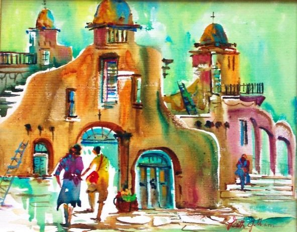
 This was my demo, taught in Lamesa. Students were given 6 different color schemes to chose from. I chose analogous colors of blue, turquoise, blue violet, with the compliment orange. The compliment of orange was to be the color focus around the figures and flower shop. The building and foreground were painted wet into wet with neutrals using the turquoise, blue, and violet keeping whites in check.....while still damp complimentary colors were introduced under the awning...after dry windows, awning, and a figures were suggested with color or light/dark values...calligraphy was added for interest.....
Friday, October 21, 2011
Turquoise Mine...Night Lights...

 My idea of contemporary art....enjoyed making shapes that could relate to industrial structure and signs seen in busy city's. The top image had thick gesso applied then scrapped with various tools to give texture. When this was dry I used gray acrylic over the surface to tone down the white gesso. Red acrylic was the dominant color with accents of turquoise to suggest industrial forms...dark lines tied the shapes together and some calligraphy marks. Black gesso was applied heavy and before dry added white gesso on the second image...using different brushes and tools to scrape through the heavy mixture drawing rectangles, circles and squares to represent signs....when dry I used watercolor in those shapes..suggesting arches to identify buildings....I also used some stamps for signage....both paintings are on canvas.
Thursday, September 29, 2011
September Workshop


Painters' up close and personal.....at the workshop....low key was the focus of thworkshop...painting on the dark side of the palette. This was a great challenge everyone. Rich dark colors are usually watered down to a tint, using more pigment and less water give them importance. Stepping out of the mid value comfort zone pushing borders...everyone accepted the challenge and did great!!
Thursday, September 15, 2011
High Key with Mid Values


The paper was dry for washes of carmine, green and orange to be painted around the white buildings, and most of the street. Before the first wash was dry I painted in greens and shadows where they were needed. My plan was to keep the painting in high key (light values) leaving bright whites. It was a challenge to paint the values needed in the beginning as to not disturb them with unnecessary washes over the same area. After the painting was dry darker values where established, calligraphy, and a wash over the foreground street... it seemed to be to light....this is 15x22 using140#Arches cold press paper. Mid values dominate keeping whites and darks connected.....
Tuesday, September 13, 2011
Mid Value Madness!!!
Step 1 Light Value

Step 2 Mid-Value

Step 3 Dark Value

After a quick sketch... Step 1 is a light wash of orange/purple/green applied to paper that had been sprayed with water. This will be the light value in the painting. Step 2...When paper was dry the mid values were applied mostly in shadow areas....the cars and people where a positive stroke of mid value. Basically reclaiming the drawing.... Step 3...The final darks were established for depth and the use of a rigger brush finished up with calligraphy marks...
Where I Left Off!!
As much as I like to paint first things first came calling.....like being with my 85 year old sister as she went through shoulder replacement. With that said all is well and I am trying to untrack. Although I was unable to paint, reading books from my stock pile brought me back to some basics. Although I understand mid values this review caught my attention concerning the importance these values play in a composition. When lights and darks sit side by side they don't enjoy one another without mid-values. They tend to always be in competition with each other...along comes mid-value and romance begins. Mid-values can be a mixture of the colors being used, which some call mud....actually they are cool or warm grays that unify the painting as a whole. A mid-value painting can be mid value colors these 'middies' are what I refer to as colors that are easily recognized (cobalt/reds/greens). When these bright colors take center stage the neutrals or mid-values they create support their importance. So mid values can be a large portion of neutrals or pure hue...check out some of your paintings for the mid-values.
I quickly sketched a very busy street with the thought in mind to concentrate on mid-values. So this is the sketch and the three steps which entertained me for the afternoon....
Wednesday, August 17, 2011
Cloudcroft Art


 Catching the fever....painting on canvas or paper which ever surface suited the painter. Learning for me is greater than what students receive from my students is much more than what they might take home. A week with inspiring eager to learn ladies sets old fires burning. Had a great time new faces, new stories plus painting almost none stop....
thank you class for encouraging me and hope you took something with you and continue painting....JoBeth
 This was the last day's demo..on 140# Arches cold press paper.. some painted on canvas and unfortunately I didn't get photos of their work. By the end of the week their work was superior to mine...so maybe it was a plus for me. Keep painting and enjoy the talent of visually seeing subjects different.
Wednesday, July 20, 2011
Still Life Class...

 My definition of a still life is anything not moving which just about takes care of most subjects.
St. Francis Hotel, Santa Fe, was my reference photograph. It was actually taken from the sidewalk looking in but I visualized the waiting table from inside.
On Arches #140 paper, I decided on a a low key painting. Wanting the darks to stay as dark as possible it was necessary to paint on dry paper. I used every dark value on my palette....painting around whites and any value that would become a mid value. The shadows were painted at random thinking about shape not actual cast shadow. To finalize, negative darks were painted and calligraphy marks....this was fun and that's what it's all about.
The photos below were other's having fun......or maybe not....
Brenda with one more stroke of green...

Diane's brush with negative shape

Linda and Donnie comparing notes...


from the palette of Adriana.....

Saturday, July 9, 2011
Exercises..no not Pilate's!!!


These are warm up studies I often do...to motivate myself to paint. These are painted with a 2 inch flat brush....no pencil drawing...just shapes. This helps to loosen up and use my imagination, I see you laughing that is if you know me. Great for exploring new colors or color schemes...most are painted on the back of those paintings you don't want anyone to see after your gone....
Friday, July 8, 2011

Friday, June 17, 2011
My Scene

Wet the surface of the paper wash on
New Gamboge and Cadimum Orange
over the people....the center of interest..

While paper is still wet quickly
add mid to darker values of cool reds
greens, blues and purples out to the
papers edge. The challenge is to
keep colors edges soft and graded
After the paper is totally dry
shadows are used to define the
subject. The contrast of lights
and darks at the center of interest
are the main players. The dark edges
are out of focus with hints of color.

Calligraphy and final darks where
they were needed.....I introduce
'Two Please'
Saturday, June 11, 2011


Friday, June 10, 2011

Friday, May 20, 2011
the "what Challenge"
 St. Francis Hotel, in Santa Fe, NM, has a lot of potential for paintings. This photo is a balcony with great color and shapes. Great sign....right in the middle, is it necessary....if so where do I need to move it. This is one of those photos that lends itself to two paintings....love those because of the options. Color is always up for grabs....local or a different palette? If you chose to paint this let me know how it turns out or if you have questions....

St. Francis Hotel, in Santa Fe, NM, has a lot of potential for paintings. This photo is a balcony with great color and shapes. Great sign....right in the middle, is it necessary....if so where do I need to move it. This is one of those photos that lends itself to two paintings....love those because of the options. Color is always up for grabs....local or a different palette? If you chose to paint this let me know how it turns out or if you have questions....

"the what challenge"
...this is for those of you with the urge and time to paint but don't know what..or....how. This challenge is to get you started...I created it for a watercolor newsletter which several enjoyed so will continue on this blog. Periodically I will post a subject for you to paint or use something similar with your stash of references. Instruction will be given in regard to color use, technique, value, texture, and because watercolor is that versatile medium it lends itself to many fun experiments. Hope you enjoy and look forward to seeing what your style brings to the table or easel.
Use your creativity to paint this window as if you live there...what would you change...would it be on a larger building...or just a portrait of a window. The choice of color is yours but think mid key values. Aesthetics can dress up any structure....have fun..JoBeth
Subscribe to:
Posts (Atom)